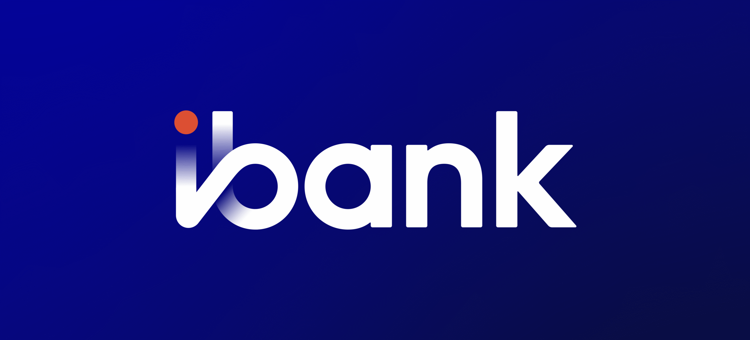
iBank’s rebranding marks an important step in our journey of growth and transformation. At the center of this new chapter is our logo, an identity that captures who we are today and what we aspire to become.

The logo is modern, simple, and purposeful. The lowercase “i” stands for YOU, the individual at the heart of everything we do. Above it, the orange dot represents the spark of technology, which drives progress, powers innovation, and enables better banking experiences.
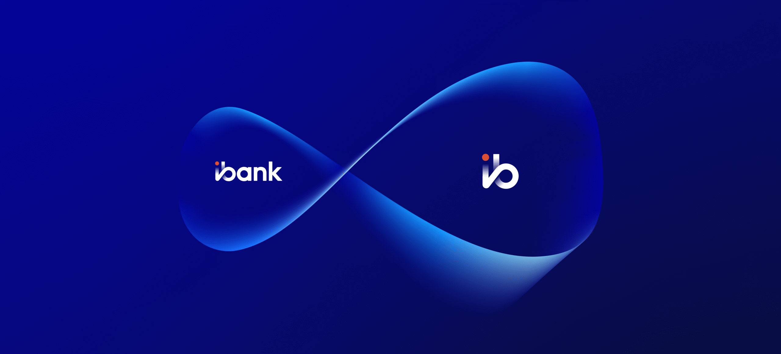
When standing together, the “i” and “b” form a sense of infinity, a symbol of continuous improvement, sustainable growth, and limitless opportunities. Together, they highlight the harmony between human connection and digital advancement. The colors further strengthen this meaning. The fresh, vibrant orange reflects energy, optimism, and innovation, while the deep, stable blue conveys trust, reliability, and security. Together, they mirror the balance between progress and stability that defines iBank.
More than just a logo, this identity reflects our commitment to building lasting partnerships, driving innovation, and shaping a future of financial growth and trust in Cambodia. It is a symbol of our promise: iBank, Your Infinite Banking Experience.
Stay connected with us and discover more about iBank’s journey. Follow us on our social media channels for any updates, insights, and stories that shape the future of banking in Cambodia via this link: https://ibank.com.kh/social/